Friday, April 2, 2010
Easter challenge: O'Keefe
I'm calling this one a challenge because it's not an assignment per se. Please continue to work on the previous assignments and post them as you finish them. For this weekend, since it's Easter, let's focus on taking pictures of Easter-y things (eggs, pretty dresses, flowers, food, etc.). As you're taking these pictures, try to emulate the style of a Georgia O'Keefe painting (see here if you're not familiar with her work). Focus on colors (especially pastels) and smooth, gentle lines. Create a picture of beauty to celebrate this weekend and share it with us!


Tuesday, March 23, 2010
March assignment: Kristine
I didn't get out to take pictures nearly enough. Today was a beautiful day and I'm still not in the habit of grabbing my camera when I leave my front door. Sigh. Here's to hoping for more nice weather--and more photography!
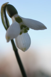
Even so, I did take a few pictures, mostly on a single walk with my (not terribly patient) daughter. My representational is a flower (obviously) that I was so excited to see! I love this part of spring!
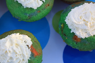
I'm going to call the cupcake picture I took on St. Patrick's day my abstract because the focus was supposed to be on the circles (and it's not really a food picture).
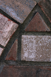
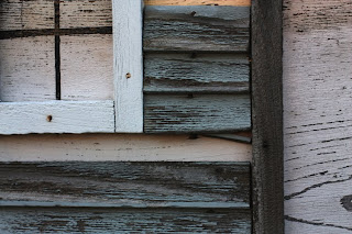
My last two pictures are textures (or so I'm claiming) of mailboxes in the neighborhood where I walk.
Even so, I did take a few pictures, mostly on a single walk with my (not terribly patient) daughter. My representational is a flower (obviously) that I was so excited to see! I love this part of spring!

I'm going to call the cupcake picture I took on St. Patrick's day my abstract because the focus was supposed to be on the circles (and it's not really a food picture).

My last two pictures are textures (or so I'm claiming) of mailboxes in the neighborhood where I walk.


Monday, March 22, 2010
March assignment: Jessica
This was a hard assignment for me... but I enjoyed it! But now I need your help :) The non-representational part really gets me. I think I understand representational and abstract though. Ummm... well, we'll see about that....
The top photo is representational:

I'm going to say this one is abstract:

I *think* these two are non-representation but... ummm, help?
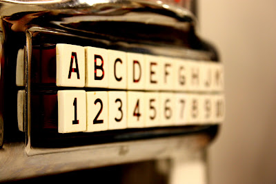

Let me know what you think...
The top photo is representational:
A flower... (yeay for spring!)

I'm going to say this one is abstract:
A portion of a chain...

I *think* these two are non-representation but... ummm, help?


Let me know what you think...
Tuesday, March 16, 2010
I heard a thousand blended notes
The next few days are supposed to be lovely around here, which makes me want to go out and take some pictures! So, I'm issuing a challenge to us all this week: take pictures every day. That's the first part, anyway. The second part will take a bit more thought. We had a lesson on line. If you haven't done that yet, work on that, but also, as you're taking pictures, think about whether they qualify as representational, abstract, or non-representational. I'll post pictures of the three below, but in brief, here are some thoughts on what each type of photo should embody (and those who have taken Wendy's class or have thought about this more than me--please chime in!)
Representational--it is what it is. Photos of objects where it is obvious what the object is. Includes portraiture, still life, landscape, and wildlife photography, among others. Most pictures will probably fall into this category.
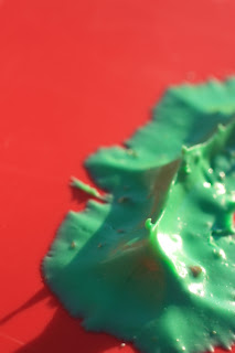
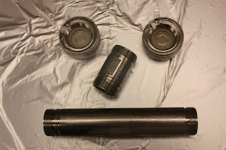
Abstract--a small portion or detail of a larger object; a picture of something that evokes another (non-related) object.
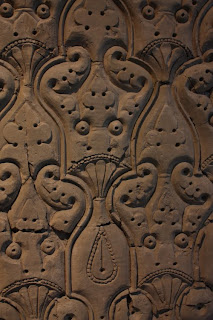
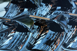
Non-representational--a detail or texture where the identity of the original object is obscure.
The dividing line between categories can be fuzzy, so I expect there will be some discussion of why someone thinks an image is abstract vs. non-representational. While a lot of us are already pretty good at representational, the other two tend to be more of a challenge. Getting better at the other types of photography/art will add depth to your photography--if you think about the truly stellar photo albums you've looked at, you'll notice that they mix all of the above types of art in to create not just images of the event, but also capture the emotions.
I'd like to see everyone post at least three images (preferably six), one or two in each category (representational, abstract, and non-representational) and I'd like to see them by Sunday, March 21. Take advantage of the next few days of good weather and take some pictures of the emerging spring, of your kids erupting from the buildings we've kept them imprisoned in for the last months, or of anything else that strikes your fancy. And have FUN!
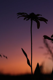
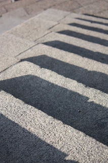
Representational--it is what it is. Photos of objects where it is obvious what the object is. Includes portraiture, still life, landscape, and wildlife photography, among others. Most pictures will probably fall into this category.
Abstract--a small portion or detail of a larger object; a picture of something that evokes another (non-related) object.
Non-representational--a detail or texture where the identity of the original object is obscure.
The dividing line between categories can be fuzzy, so I expect there will be some discussion of why someone thinks an image is abstract vs. non-representational. While a lot of us are already pretty good at representational, the other two tend to be more of a challenge. Getting better at the other types of photography/art will add depth to your photography--if you think about the truly stellar photo albums you've looked at, you'll notice that they mix all of the above types of art in to create not just images of the event, but also capture the emotions.
I'd like to see everyone post at least three images (preferably six), one or two in each category (representational, abstract, and non-representational) and I'd like to see them by Sunday, March 21. Take advantage of the next few days of good weather and take some pictures of the emerging spring, of your kids erupting from the buildings we've kept them imprisoned in for the last months, or of anything else that strikes your fancy. And have FUN!


Friday, March 12, 2010
Fun Photoshop Tutorial
So, this tutorial won't really help in improving your images...but I thought it was fun since I never change my hair color! (This youtube channel actually has quite a bit of useful portrait tutorials as well!)
Changing Hair Color: http://www.youtube.com/watch?v=bHAgz83nhQ8&feature=channel
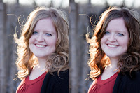
Changing Hair Color: http://www.youtube.com/watch?v=bHAgz83nhQ8&feature=channel

Thursday, February 4, 2010
Editing: Margot
I've been using Photoshop for years now for basic editing and for the life of me could not figure out what an 'action' was (I haven't watched the tutorial yet). I just opened Photoshop tonight and figured it out. All along it was sitting right next to the 'history' menu I use all the time!
I was going to avoid this assignment because I can spend hours clicking through every option until my photo looks just the way I like it--I just start pushing buttons and see what I get. But I did it anyway since it's fun.


I was going to avoid this assignment because I can spend hours clicking through every option until my photo looks just the way I like it--I just start pushing buttons and see what I get. But I did it anyway since it's fun.


my nephew, Matt. Crop, soft light, lighten, warming filter (85), shadow25/highlight15.


my sister and her family. I really want to go back and get this shot without them in it. I love this bridge.
Crop and rotate left, black&white, hard light, lighten, sharpen, shadow/highlight, (and maybe something else that I forgot).


my niece, Emily. Crop, brighten & more contrast, soft light, shadow 25%.
Wednesday, February 3, 2010
Editing: Jessica
I don't know about anyone else, but I am having so much fun with editing after getting tips from Kim. I was always terrified of photoshop and now I'm not :) When I learn to do new editing skills I tend to go over board and do to much to my photos. I have been trying not to do this. If you have any tips or pointers for me, let me know.
This photo I took in November and all the pictures I took in this spot turned out really gray. I tried editing in Picnik and I didn't like what I came up with.

In photoshop I added a "Soft Light" layer (Pioneer Woman has a tutorial on how to do this but with "Hard Light" HERE). And then I used PW warmer action (40%) and this is what I came up with:
I like how the photo pops a little now that it isn't so flat and gray. I also like that there is a little more color in her skin tone. But I am worried that I went a little over the top....
This picture is a favorite of my son. In photoshop I used PW seventies action, quick burn action and sharpen action (too much?)
This photo I took in November and all the pictures I took in this spot turned out really gray. I tried editing in Picnik and I didn't like what I came up with.
Here is the original:

In photoshop I added a "Soft Light" layer (Pioneer Woman has a tutorial on how to do this but with "Hard Light" HERE). And then I used PW warmer action (40%) and this is what I came up with:

I like how the photo pops a little now that it isn't so flat and gray. I also like that there is a little more color in her skin tone. But I am worried that I went a little over the top....
This picture is a favorite of my son. In photoshop I used PW seventies action, quick burn action and sharpen action (too much?)
Original:

Edit:

I liked how the seventies action toned down the red in his skin. I also like the contrast that the edge burn creates. What do you think?
Subscribe to:
Posts (Atom)